Strategy
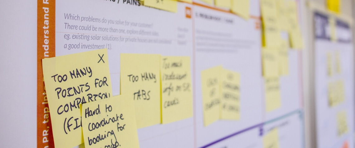
We spend a lot of time working on the strategy before we ever touch design. Why? Because strategy is what makes your website hum. By understanding exactly who your most lucrative customers are and what makes them say “yes,” we can design a site that more than pays for itself in the form of a higher conversion rate, stellar first impression, and ongoing reputation & brand management.
How do we do it?
- Analyzing market data, competitors, what you’ve been doing and what you want to do
- Figuring out who currently does it best in the market and what that looks like
- Determining who your best customers really are
- Honing in on your true target market (now that we’ve identified them)
- Helping you uncover what your best customers really want
- Conducting Focus Groups and User Testing as necessary

Building a house is a great analogy for building a website
Just like how a house can look pretty on the surface but actually be made with sub-standard materials and shoddy workmanship, a website can be much the same. Have you ever seen the movie The Money Pit with Tom Hanks? Building a cheap website is kind of like that.
On the surface, the price makes it look like a great deal. There are lots of head nods in ascent as the developer promises to create just what you need – and look! It’s only going to cost a few thousand! So you sign on the dotted line, and work begins.
Unbeknownst to you, the design they’re developing doesn’t speak to your core audience. Those big spenders and lifetime customers. The user experience is clunky, and all the wrong buttons are in all the wrong places. This new website doesn’t convert readers into customers and partners as it should. It’s generic. It’s not based on customer data. It was probably built from a template they’ve used for dozens of other sites. You may have only spent a few thousand for the site itself, but you’re losing much more than that every week you keep it running and miss out on lucrative potential partnerships. It’s a money pit. Damn it!
Don’t be the poor schmuck who falls for that bullshit.

At Kreate, we have a different approach
We’re not going to fall all over ourselves to design a cheap website that does nothing for you. There are plenty of other designers willing to do that. We develop websites that sing. The kind of site your customers can’t get enough of. One that speaks directly to them and whispers “open your wallet.” Ok, maybe it’s not that direct, but it will pay for itself in the form of customer conversions. And that’s a promise.
Getting to Know You
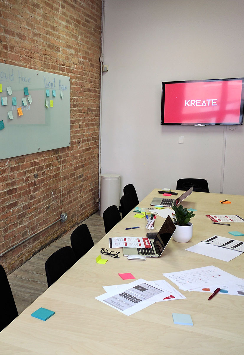
Here’s where the fun begins! We’ll pour over the details of your company and what you need like a helicopter mom getting her kids ready for the first day of school. If you have ideas about how you want your product to look or what you think would work, we want to hear about it. We’re all about collaboration, and this is just the beginning.

Design is creativity with strategy