Branding
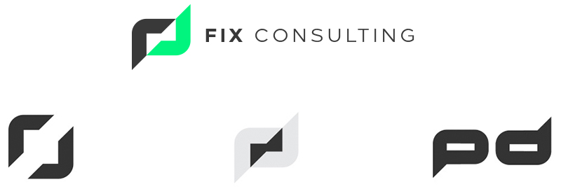
This was definitely a tricky one. We spent countless hours and hundreds of different concepts before finally coming up with the new logo. Each failed concept contributed an element that paved the way to the creation of the new FIX logo.

The idea behind the final logo is 2 opposite facing arrows, which represent thinking in all directions. The are other complementary meanings, such as a speech bubble, which represents consulting, as well as a negative space bolt which represents energy.

