Project Overview
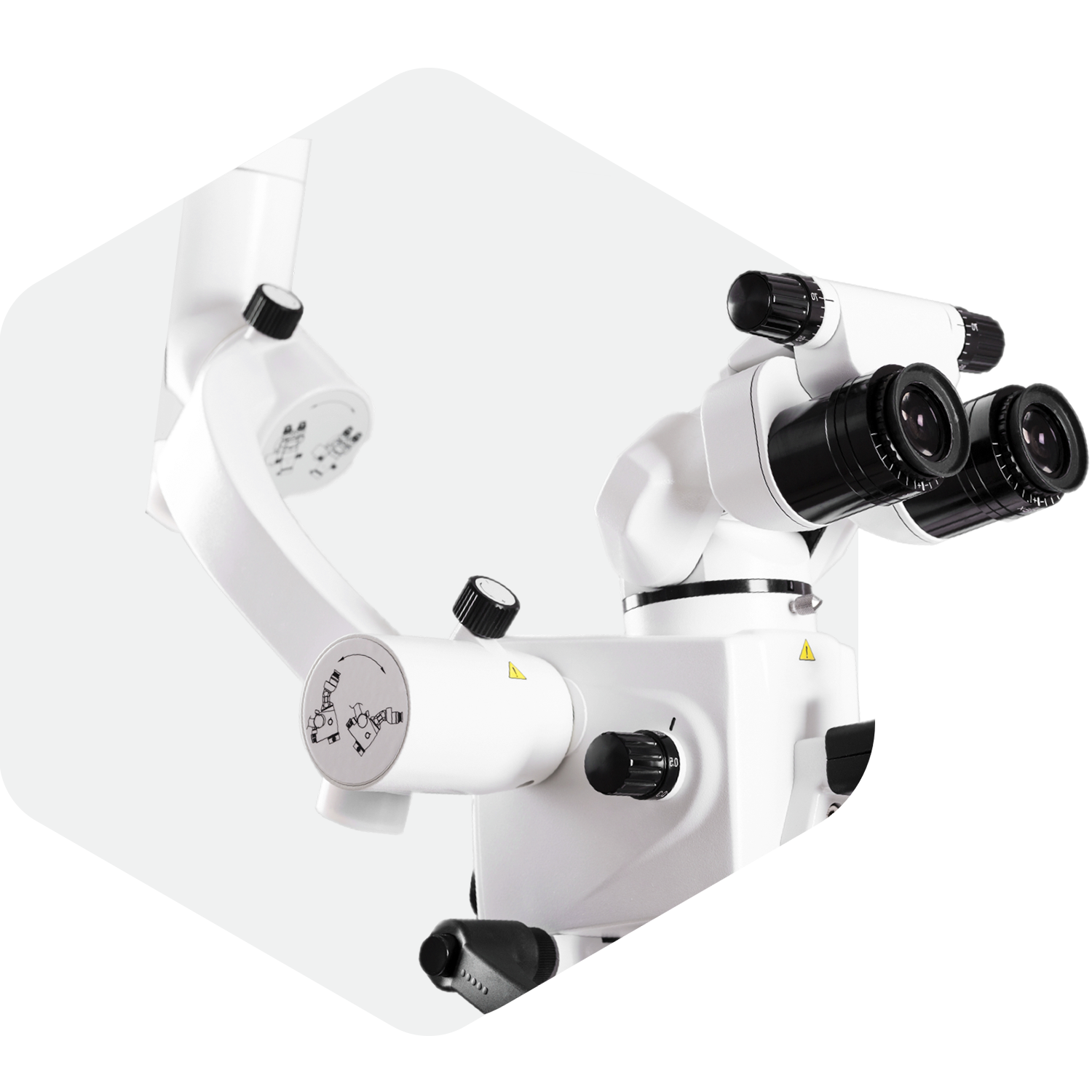
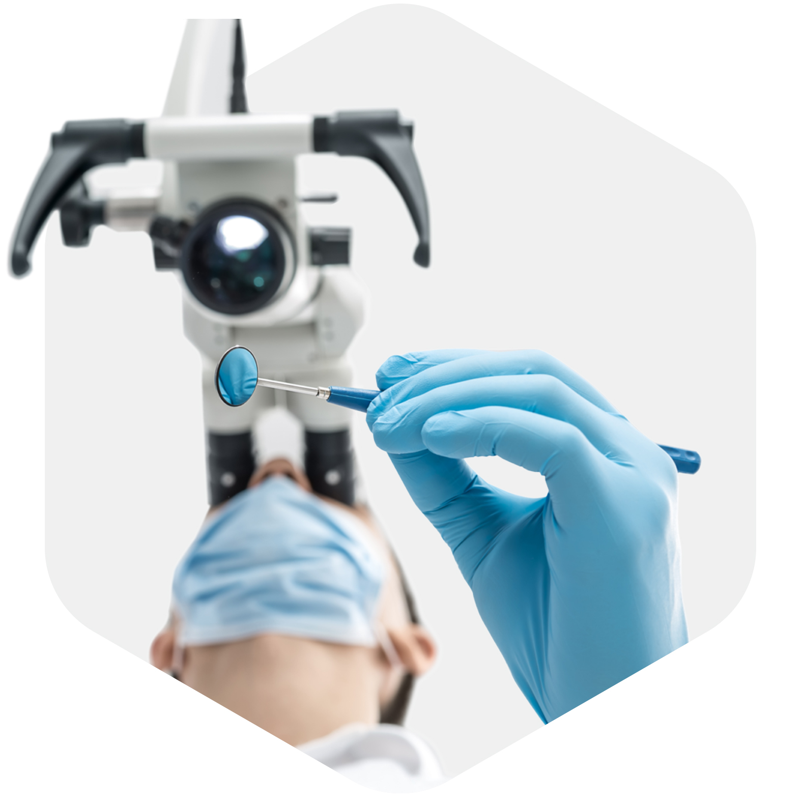
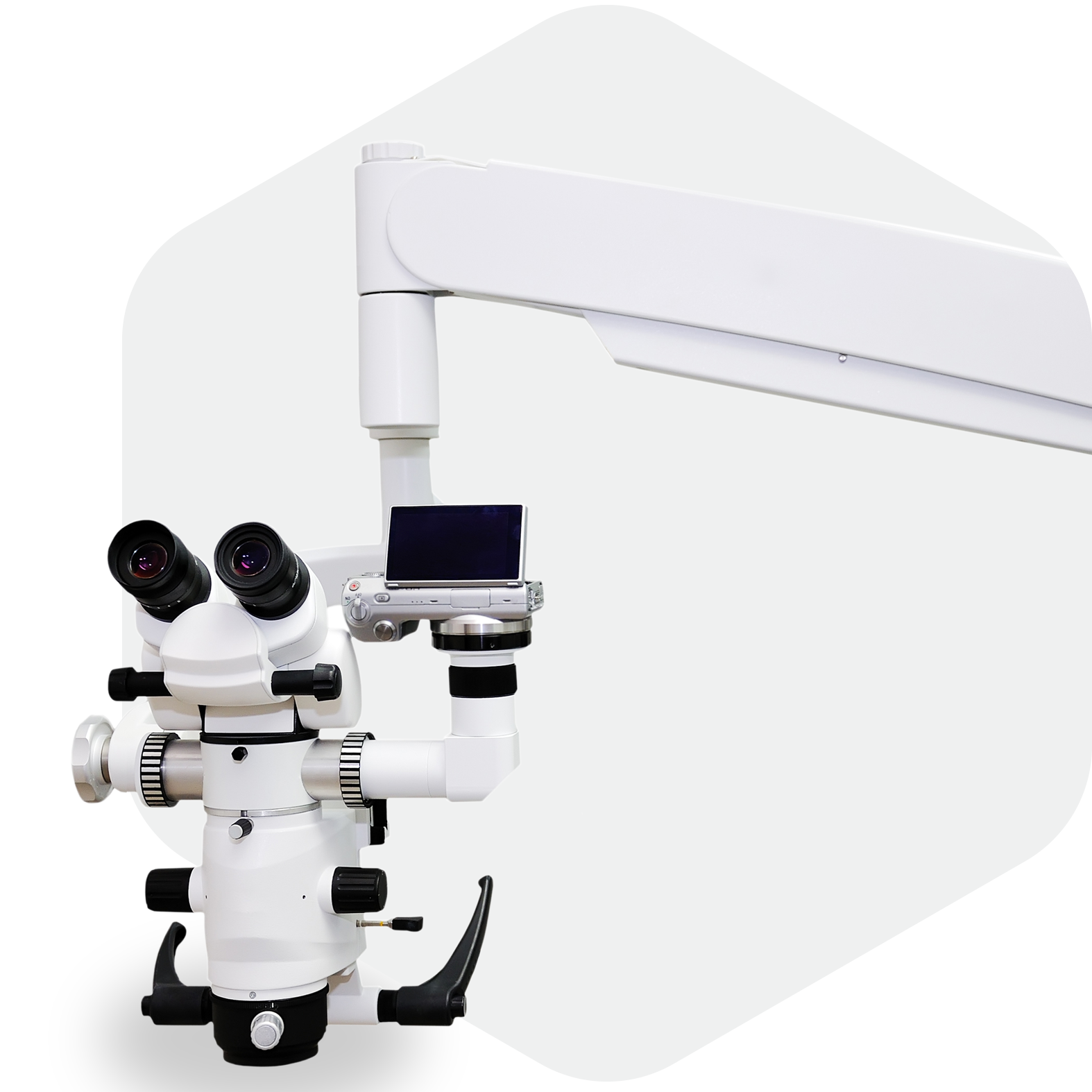
Molar City is a new dental office which differentiates itself from other dental practices by using microscopes. Using microscopes has tremendous benefits for both patient and doctor. The doctor is able to sit more ergonomically and see everything much clearer and closer. The patient can see all of this on the screen and be better informed of the treatment plan. Our job was to build a website that highlights all of this in a robust and effective way.


All about the user experience
People are already frustrated when they have a toothache, so we didn't want the website to add any more pain. Viewers are able to easily book an appointment no matter what page they are on, see all the services and benefits of microscopes without any unnecessary clutter, and educate themselves on the benefits of microscopes in the process.

Simplicity in Design
The design of the website is reflective of Molar City's dental studio: clean, modern, and simple. We used the hexagonal shape from Molar City's branding, combined it with the purple/white/grey tones, and sprinkled in some awesome copy, photography, and custom iconography to tie it all together.

